
- carpet-wall-color-basics - understanding how colors interact in interiors
- warm-vs-cool-tone-balance - creating emotional harmony in rooms
- light-dark-contrast-strategies - avoiding flat or overwhelming spaces
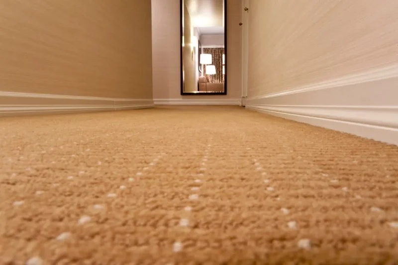
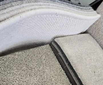
- texture-pattern-flooring-impact - how materials affect visual design
- real-home-design-case-studies - practical transformations and lessons
Why Carpet and Wall Color Harmony Changes Everything in a Room
Choosing the right carpet is not just a flooring decision—it defines how a room feels the moment you step inside. The relationship between carpet and wall color sets the emotional tone of your space, influencing whether it feels cozy, spacious, modern, or heavy. Understanding how to match your carpet with your wall color is one of the most overlooked yet powerful interior design skills.
Many homeowners focus on furniture first, but professionals often start with the largest visual surfaces: walls and flooring. These two elements create the foundation for everything else. When they clash, even expensive decor looks disconnected. When they harmonize, even simple furniture feels intentional and well-designed.

Top Notch Flooring America
White MarshBaltimore CountyMaryland
5022 Campbell Blvd Suite D and E, Nottingham, MD 21236, USA
Understanding Color Relationships in Interior Spaces
Before selecting any carpet, it’s important to understand how colors interact. Interior design is not about choosing favorite colors—it’s about balancing undertones, brightness levels, and contrast in a way that supports the function of each room.

Warm vs Cool Tones and Their Emotional Impact
Warm tones like beige, terracotta, and soft browns create comfort and intimacy. Cool tones such as gray, blue, and muted green promote calmness and spaciousness. When pairing carpet and wall colors, staying within the same temperature family often creates a more cohesive and visually stable environment.
For example, a homeowner in Chicago once replaced a cool gray carpet with a warm taupe version while keeping soft white walls. The result was a noticeable shift: the living room felt less sterile and more inviting without changing any furniture.
Neutral Foundations for Long-Term Flexibility
Neutral carpets are often chosen because they allow flexibility in wall color changes over time. Shades like ivory, sand, and soft gray act as a visual anchor, letting you experiment with bolder wall colors without overwhelming the space.
This approach is particularly useful in rental homes or evolving design styles, where frequent updates are expected without replacing major flooring elements.
How Wall Color Influences Carpet Selection
Walls dominate vertical space, meaning they heavily influence how flooring is perceived. A carpet can look completely different depending on whether the wall is light, dark, warm, or cool. This is why designers always evaluate both surfaces together rather than independently.
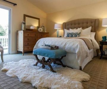
Light Walls with Dark Carpet for Grounded Balance
Light-colored walls paired with darker carpets create a grounded, structured look. This contrast adds depth and prevents rooms from feeling too washed out. It is especially effective in larger rooms where visual definition is needed.
However, too much contrast can feel harsh if not balanced with soft furnishings like curtains or cushions that bridge the color gap.
Dark Walls with Light Carpet for Airy Contrast
Dark walls combined with lighter carpets create a dramatic yet elegant atmosphere. This pairing is often used in modern or luxury-inspired interiors where visual impact is a priority.
One real-world example comes from a renovated Brooklyn loft where charcoal walls were paired with a light beige carpet. The result was a sophisticated balance between boldness and openness, making the space feel both artistic and livable.
Common Mistakes When Matching Carpet and Wall Color
Many design issues come from subtle mistakes rather than obvious errors. One of the most common problems is choosing carpet and wall colors that are too similar in tone, resulting in a flat and uninspiring room.
Avoiding Monotone Overload
When walls and carpets share nearly identical shades, the room loses dimension. Instead of creating harmony, it can feel visually dull. The solution is introducing contrast through either brightness, undertones, or texture.
Even a slight variation in tone—such as pairing warm beige walls with slightly cooler sand-colored carpet—can dramatically improve depth and interest.
Ignoring Natural Light Conditions
Lighting plays a major role in how carpet and wall colors appear. A color that looks balanced in a showroom may appear completely different in a north-facing room with limited sunlight.
Design professionals often test samples in different lighting conditions before making final decisions to ensure long-term satisfaction.
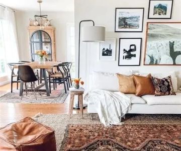
Texture, Pattern, and Their Role in Visual Balance
Color is only part of the equation. Texture and pattern also influence how carpet interacts with wall color. A highly textured carpet can soften bold walls, while a smooth carpet enhances minimalist interiors.
Patterned Carpets for Neutral Walls
If walls are painted in a simple neutral tone, patterned carpets can introduce personality without overwhelming the room. Geometric or subtle abstract designs work especially well in modern homes.
However, balance is key—too many competing patterns between walls and flooring can create visual chaos.
Solid Carpets for Bold Wall Colors
When walls feature strong colors like navy, forest green, or deep terracotta, solid carpets help stabilize the visual experience. This prevents the room from feeling too busy and keeps attention focused on architectural features or furniture.
Real Home Transformation: From Dull to Balanced Living Room
A homeowner shared a renovation experience where their living room originally had beige walls paired with a slightly darker brown carpet. The space felt heavy and outdated despite having modern furniture.
After consulting a designer, they switched to a lighter oatmeal carpet and introduced soft sage green walls. The transformation was immediate—the room felt brighter, larger, and more welcoming without changing its layout.
This example highlights how small adjustments in carpet and wall color coordination can completely redefine a living space.
Building Long-Term Design Harmony in Your Home
The best interior designs are not based on trends but on balance, adaptability, and personal comfort. Matching carpet with wall color is less about rigid rules and more about understanding relationships between tone, texture, and light.
For homeowners looking to explore curated flooring options and professional pairing suggestions, CarpetHub offers inspiration and resources designed to help create cohesive and visually balanced interiors tailored to different lifestyles and preferences.

 Crenshaw Flooring4.0 (56 reviews)
 Floor Coverings International - East Brunswick5.0 (45 reviews)
 At Home4.0 (154 reviews)
 Nolt's Floor Covering4.0 (124 reviews)
 Arshs Fine Rugs (Saturday By Appointment)5.0 (7 reviews)
 Seashore Ace4.0 (168 reviews)
 How to Select Carpet for Your Home’s Entryway or Foyer | CarpetHub
 What Carpet Styles Are Best for a Minimalist Home?
 What Are the Benefits of Choosing a Frieze Carpet for Your Home?
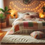 Creating a Warm and Inviting Space with Carpets
 How to Select the Right Carpet for Your Living Space
 The Ultimate Carpet Maintenance Checklist for Busy Households